vol. 14 no. 2, June, 2009
vol. 14 no. 2, June, 2009 | ||||
This paper describes the use of multiple correspondence analysis (MCA) for data exploration as part of a recently completed study of the use of information technology by literary authors. The study (Paling 2008) discussed in this paper constitutes part of an ongoing effort to establish Literature and Art Informatics, the interdisciplinary study of the design, uses and consequences of information technologies that takes into account their role in the creative efforts of writers and artists (Paling 2006; Kling 1999).
Correspondence analysis is 'an exploratory multivariate technique that converts a matrix of nonnegative data into a particular type of graphic display,' and multiple correspondence analysis is 'concerned with displaying the categories of more than two discrete variables' (Greenacre & Hastie 1987: 437). Multiple correspondence analysis takes data from multiple scales and establishes maps in non-Euclidean, low-dimensional vector space that look superficially like scatter plots. The points can represent various entities such as individual respondents or descriptive categories. Mathematically, the technique is related to factor analysis (Gauch 1982: 162-163) and multidimensional scaling (Clausen 1998: 6). However, it is used principally for exploratory data analysis and does not have the techniques for hypothesis testing of the related techniques. The method is designed for the analysis of categorical data and makes no assumptions about the underlying distribution (Clausen 1998: 6).
This paper is aimed at an audience of potential users of this technique who want to understand the conceptual background and see an example of its use. It will focus primarily on use and interpretation. It takes an intermediate approach, mediating between pure methodological papers on one hand, and, on the other hand, topical papers that provide a highly abbreviated description of the method described here. A complete mathematical explanation is available from Greenacre (1984). This paper has two goals:
The study described in this paper (and in Paling 2008) follows work (Paling and Nilan 2006) that posited a synthetic conceptual framework made up of four key values, adapted from Bourdieu (1996), to describe the motivations of editors of little magazines in pursuing their creative goals. The key values were Positive Regard for Symbolic Capital, Negative Regard for Immediate Financial Gain, Positive Regard for Autonomy, and Positive Regard for Avant-garde-ism. The study found evidence of support for three of the four key values, and posited the idea of intensifying use of technology to describe the use of information technology to pursue a value more strongly than before. Intensifying use of technology has three elements:
The current study focused primarily on one of those key values, Positive Regard for Avant-garde-ism, in order to validate part of the original findings in greater detail and test the feasibility of quantitative methods in this context.
Bourdieu (1996) wrote extensively about the literary community, but did not specifically address the role of information technology in the creative lives of authors or artists. This paper will focus on two conceptual constructs, consecration and information-technology-orientation, which are being developed for mapping techno-literary spaces, defined here as maps, created through multiple correspondence analysis, of the associations between authors based on similarities and differences in their approaches to using technology in their creative efforts, the degree of consecration attained by each author, and the authors' views of Positive Regard for Avant-garde-ism. Consecration, as conceived by Bourdieu (1996: 123), refers to the achievement of decorations, prizes, and awards of various kinds, including appointments to academic positions. Those achievements are directly germane to understanding the creative efforts of literary writers since writers will often define themselves in terms of such achievements, whether through participation or opposition. Information-technology-orientation was defined in the current study as the use of information technology in an author's efforts to create and publish literary work. These elements serve to establish a link between the broader fields of social informatics and the study of literature and art.
Bourdieu (1996, 1984) made use of various social maps, which were a key part of describing what Bourdieu termed position taking:
...we must reconstruct the space of the artistic position-takings, both actual and potential, which was the context for the formulation of the artistic project, and which we may assume, as a hypothesis, is homologous with the space of positions in the field of production itself, as it has been roughly described. To construct the author's viewpoint in this sense is, if you will, to be put in his place ... . (Bourdieu 1996: 87-88)
Bourdieu argued that these position-takings established an artist's proximity to particular types of art such as literary writing or popular art.
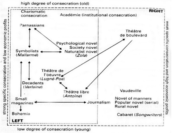
There are several key differences that set the current study apart from Bourdieu's, however. First, Bourdieu did not always use empirical data in constructing his maps, instead creating maps which were conceptual in nature. Figure 1 shows one such map based on degrees of consecration and economic profits. No explicit empirical data were provided with the map.
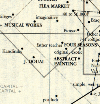
Secondly, when Bourdieu did incorporate empirical data into the construction of his social maps, he did not focus on information technology use by authors or other artists. Figure 2 shows an excerpt from one such correspondence map used by Bourdieu, which shows Picasso lying close to abstract painting, but farther from pot-luck dinners. The use of multiple correspondence analysis in this paper is less wide-ranging and will focus specifically on literary authors, their use of information technology and their support for Avant-garde-ism.
Bourdieu is not the only scholar to apply multiple correspondence analysis or related methods to the study of the arts. Rawlings and Bourgeois (2004) applied multidimensional scaling and hierarchical cluster analysis in a study of the emergence and differentiation of institutional categories in American higher education. They examined a wide range of phenomena from music and fine arts consumption to the popularity of sports and other leisure activities. The study of institutional categories bears significant similarities to the study of genres. Institutional award structures such as publication and tenure depend in part on an individual's work being recognized as part of an accepted genre. The willingness of consecrated authors and editors to recognize aesthetic value in electronic literature will play a key role in whether or not that literature finds its place among other types of recognized literary writing such as more established modes of poetry and fiction.
Sintas and Álvarez applied correspondence analysis to study the pattern of performing arts attendance in Spain. In a manner similar to Bourdieu's, they mapped a structural space of performing arts consumption in Spain. The performing arts examined in that study covered a large range of art types, including such phenomena as flamenco, folk music and theatre (Sintas and Álvarez: 2004: 475). The current paper focuses on the American literary community and covers a considerably smaller swath of the arts, being limited to the production (as opposed to consumption) of literary writing, but substantial similarities obtain. This study defined a genre as a particular type of social structure, a recurring pattern of rhetorical action recognized as similar by a rhetorical community. The current study offers us a way to begin understanding how literary authors can use information technology to establish a position within the social structure of a genre. For example, a poet could use a hypermedia authoring program such as Flash to produce a poem not possible in print. If that work is accepted, particularly by more-consecrated members of the literary community, then the range of recognizable rhetorical actions is expanded. In literary writing other producers often simultaneously serve as audience members. Bourdieu argued persuasively that 'the credit attached to any cultural practice tends to decrease with the numbers and especially the social spread of the audience,' and he referred to 'the specific competence recognized in the consumer' (Bourdieu 1996: 115). Literary writing has a largely internal audience, so it is important to understand the positions taken by the actors who enact and evaluate literary genres. Because of the increased availability of information technology for producing literary works, its use by literary authors now constitutes one of the ways in which they can define their positions within the literary community. The current study is one of a series that seeks to begin a structured empirical inquiry about the authors' use of technology. Multiple correspondence analysis provides a useful way to visualize the positions taken by the authors.
Multiple correspondence analysis and similar techniques have also been used in the study of information. Doré and Ojasso (2001: 763) used correspondence factor analysis to analyse scientific productivity across countries as measured by publication trends. Their work is relevant in at least two ways to the present context. First, productivity in publication is one of the markers used in the current study to define consecration. Doré and Ojasso were concerned with different measures, e.g., percent outputs in a discipline (2001: 764), but the bibliometric notion of scientific impact is not completely dissimilar to the idea of consecration in a literary setting. Secondly, Doré and Ojasso incorporated publication trends over time. This is similar to Bourdieu's inclusion of trajectories in his own analyses (Blasius and Thiessen 2006: 233). Bourdieu (1996: 240) pointed to what he termed social ageing, the initial rejection by structurally younger (i.e., less-consecrated) writers of the signs of consecration. As time passes, however, 'Each successful revolution legitimates itself [and] tends to impose itself as the model of access to existence in the field' (Bourdieu 1996: 125). The current paper takes a predominantly synchronic view of the phenomena being discussed, but the research described here is at an earlier stage of development than Bourdieu's. The possibility of introducing diachronic elements leaves open future research questions and the possibility of tracking changes in aesthetic positions over time.
Shen et al. used correspondence analysis to evaluate university library Web sites in China. They referred specifically to positioning as used in marketing (Shen et al. 2006: 493), and applied the concept to the ways in which libraries can use their Web sites to emphasize 'different key attributes [and] have different positioning in the Internet system' (Shen et al. 2006: 500). They described the paper as 'a bid to strengthen the construction of library Web sites' (Shen et al. 2006: 493). Part of their analysis involved a correspondence analytic description of how libraries in China positioned themselves through their Websites. This paper lacks the prescriptive dimension put forward by Shen et al., but it similarly examines how information technology can be used to take a position within a field. Multiple correspondence analysis can help us reach a richer cultural understanding of how literary authors and editors can use the technology to subvert, support, or intensify their support for the key values that have typified American literary publishing.
Sanz-Casado et al. used correspondence analysis to study the effect of interdisciplinarity in chemistry research by scientists in Puerto Rico. They used bibliometric analysis, but they also focused on
the impact of interdisciplinarity on different characteristics of scientific activity, such as the collaboration between authors and institutions or the visibility of research papers published by Puerto Rican chemists. (Sanz-Casado et al. 2004: Introduction section, para. 4)
Interdisciplinary relationships can also be interpreted as positions vis-à-vis the respective fields. A similar phenomenon pertains to literary authors and their choices about whether and how to use information technology. For example, an author could choose to engage in writing in an online medium while still working with traditional paper media. That would put the author at the boundary of the two types of literary writing. The research described here is an attempt to measure and map those positions.
A set of simplified examples will give an introduction to parts of the current study addressed in this paper, the basic principles behind multiple correspondence analysis, and key terms. The examples in this section are adapted from Greenacre (1984: 14-41), who provides a complete mathematical explanation for those who wish to see the entire process of creating a multiple correspondence analysis map.
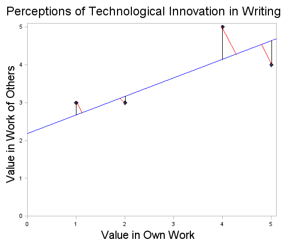
As part of the study respondents were asked how positively or negatively they viewed the use of computer technology to produce innovative literature. They were asked the question twice, once in the context of evaluating their own success and again in evaluating the work of others. They were asked to give a response on a five-point Likert scale (5 highly positive, 1 highly negative). Figure 3 shows a scatter plot of a small, hypothetical data set, with the data table superimposed. The horizontal axis shows each respondent's answer to the question about his or her own work. The vertical axis shows each respondent's answer to the question about the work of others. So, for example, the point for a respondent who valued technological innovation both in his or her own writing and the writing of others would fall in the upper right of the plot and the score of a respondent with contrasting values would appear in the lower left. Even in a simple scatter plot such as that in Figure 3, we can see the respondents' positions begin to emerge. We can say that the points for R1 and R2 lie in the direction of high valuation of technological innovation in writing. A fifth point could be added at 5,5 on the graph to represent the most extreme possible position in valuing such innovation. The positions taken by R1 and R2 would lie closer to that exemplar point than the positions taken by R3 and R4.
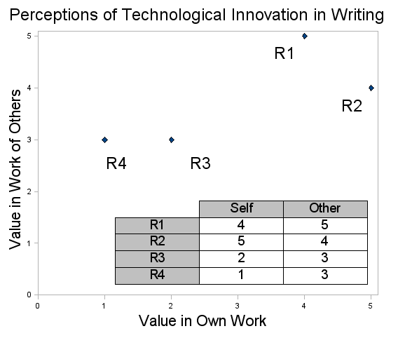
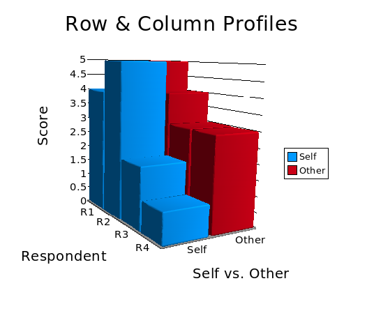
Figure 4 shows a three-dimensional bar graph of the same data. Figure 4 demonstrates the similarity in the row profiles, i.e., set of scores, of R1, R3, and R4. In each of those three cases, the respondent assigned higher value to technological innovation in the work of other authors than in their own work. In contrast, R2 demonstrated the opposite pattern, valuing technological innovation more in his/her own than in the work of others. So, while the numeric scores of R1 and R2 are similar, the up/down trend across the row differs. The similarity in numerical scores, however, shows up in the column profile. R1 and R2 have higher scores than R3 and R4, although the trend from high to low down each column is not uniform. Multiple correspondence analysis can be seen, in part, as the comparison of row and column profiles.
In the context of multiple correspondence analysis, similarity is measured as chi-squared distance from the individual points to an optimal subspace represented by a vector. A simple chi-squared example, from a second hypothetical data set, will help clarify this. Table 1 shows the hypothetical data set.
| 5 | 4 | 3 | 2 | 1 | rowfreq | |
| A | 6 | 3 | 1 | 0 | 0 | 10 |
| fe | 3 | 2 | 1 | 2.5 | 1.5 | |
| B | 0 | 1 | 1 | 5 | 3 | 10 |
| colfreq | 6 | 4 | 2 | 5 | 3 | n=20 |
| percent | 0.3 | 0.2 | 0.1 | 0.25 | 0.15 |
In this case we assume that the respondents have been divided into two groups, A and B. In Group A, six respondents chose a 5 on the FTs scale (FTs = FreshTechSelf, high regard for technological innovation in one's own work. FTo = FreshTechOther, high regard for technological innovation in the work of others.), three respondents in that group chose a 4, and so on. The middle, italicized, row contains the expected frequencies if the responses are randomly scattered through both groups, i.e., there is no discernible pattern in the responses. The values for 5 on the FTs scale serve as an example of how the chi-squared statistic works. The observed frequency for 5 in Group A is 6, and the observed frequency for 5 in Group B is 0. Both observed frequencies differ from the expected frequency by an absolute value of 3, with the observed frequency in Group A falling higher and the observed frequency for Group B falling lower. The chi-squared statistic is the sum of the squared differences in each of the cells containing observed frequencies. So, for example, 3² + -3² = 9 + 9 = 18, so the differences from the 5 column from groups A and B contribute 18 to the chi-squared statistic. The operation is repeated for each column. Unlike a normal chi-squared test for goodness of fit in which significance is measured, however, multiple correspondence analysis is meant for exploratory and descriptive purposes. The chi-squared scores are treated as distances from the expected values. The expected values fall along the least-squares line, which represents an optimal subspace from which the distance is measured.
Figure 5 shows the scatter plot from Figure 3 with additional lines added (the positions of the lines are approximate). The blue line represents the expected frequencies. The red lines represent the chi-squared distance from each point to the line of expected frequencies and are perpendicular to that line. The black lines represent the distance as calculated for regression and are perpendicular to the x axis, the axis toward which the values might be regressed in this hypothetical case. The red, chi-squared lines describe the similarity of each data point to the expected frequency.
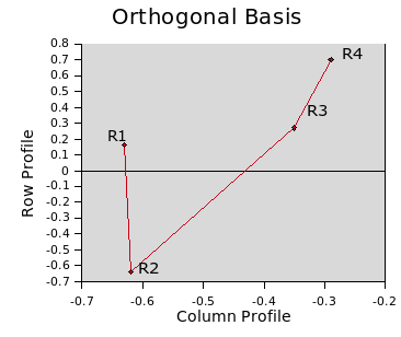
In order to compare the row and column profiles, the data matrix superimposed on Figure 3 can be used to compute an orthogonal basis for the data points. Two vectors are orthogonal if they are linearly independent, i.e., they are perpendicular. Two vectors form a basis for a vector space if the two vectors span the space, i.e., all linear combinations of vectors within the space can be expressed with values from the two vectors. Figure 6a shows the data points mapped onto the orthogonal basis. The basis was generated with SciLab 4.0 (http://www.scilab.org/), and the graph was generated from the resulting vector values using OpenOffice.org Calc (http://www.openoffice.org/).
|
|
| Figure 6a: Orthogonal basis. | Figure 6b: Row and column profiles. |
We need to keep several things in mind when interpreting graphs like those in Figures 6a and 6b. It is important to emphasize the abstract property of the resulting vector space. The axes do not represent possible points on the Likert scales, as the conventional scatter plots used above do. The axes represent the relationship between the data points and the row and column profiles. Those relationships are described using chi-squared distances.
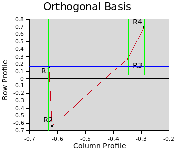
To clarify the description of the row and column profiles, Figure 6b shows where each respondent's data point would project on to the horizontal and vertical axes using, respectively, green and blue lines. Because R1 and R2 have reciprocal scores (4,5 and 5, 4), they fall quite close together on the axis representing the column profile. R3 and R4 sit farther along the axis because of their lower scores and not as close to each other because their scores are not as similar as the scores of R1 and R2.
The vertical axis (row profile) in Figure 6b provides a contrast to the horizontal axis. Because R1, R3 and R4 show a low-to-high trend across their respective rows, they fall closer together on the vertical axis. R2, the only respondent with a high-low pattern, sits farther along the axis and is the only respondent whose point sits below 0 on the vertical axis. This abstract space can be interpreted as a description of the hypothetical respondents' positions vis-à-vis technological innovation in writing. R1 and R2 fall close together in having high valuation of technological innovation in writing. R1, however, falls closer to R3 and R4 in valuing such innovation more highly in the writing of others than in her or his own writing. The relative positions in the figure reflect these similarities and contrasts in aesthetic positions based on a small set of hypothetical data.
The example described in Figures 6a-b is a highly simplified one meant only to illustrate the basic interpretative principles used in multiple correspondence analysis. The interpretative gain over a conventional scatter plot is not necessarily significant when only two dimensions are involved, since two dimensions are being mapped on to the same number of dimensions, but in non-Euclidean space. However, as additional dimensions are added the interpretative gain grows in significance, as later examples will demonstrate. Greater than two dimensions will be reduced to the two abstract dimensions of the correspondence analysis maps.
The current study made use of multiple variables to operationalize both information-technology-orientation and consecration. Because the number of variables exceeded the number that could comfortably be depicted in a conventional two- or three-dimensional scatter plot, multiple correspondence analysis offered an appropriate set of techniques for mapping the relative positions taken by the respondents in the study. The usefulness of this technique went beyond simple data reporting and exploration, however. The current study is part of a series of studies meant to foster Literature and Art Informatics. Because work in this area is new, the scales used in the study need to be viewed as developmental. Multiple correspondence analysis allowed visualization and exploration of alternative scenarios for quantifying the authors' responses. This section will discuss the original scaling, the revised scaling explored with multiple correspondence analysis, and the further research questions suggested by the differences between the two.
The study operationalized consecration with the following variables:
The total scores for consecration with the original scale values ranged from a low of 4.5 to a high of 16.
Information-technology-orientation was operationalized with a second set of variables:
The total scores for information-technology-orientation with the original scale values ranged from 6 to 22.
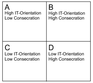
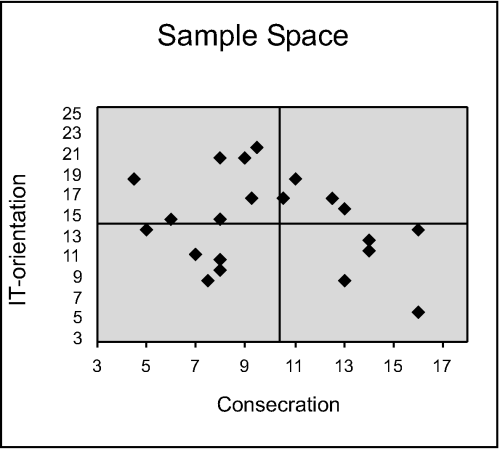
The respondents' scores for information-technology-orientation and consecration (with the scores from the constituent variables for each scale being combined) were originally used to build a simple scatter plot with which to track the purposive sample as it was built. Figure 7a shows the conceptualization of the sample space, and Figure 7b shows the actual scatter of respondents across that space.
|
|
| Figure 7a: Conceptualization of sample space. | Figure 7b: Scatter plot of sample. |
The map of the sample space turned out to be unexpectedly successful. A respondent's presence in a particular quadrant of the sample space provided useful information about, for example, how positively or negatively s/he viewed the use of computer technology to produce innovative writing through, for example, the introduction of animation. The respondents in quadrants A and B viewed that type of innovation more positively than did the respondents in quadrants C and D. It is worth emphasizing that the data for measuring consecration and information-technology-orientation came from separate instrument items than the items that produced data for the FreshTechSelf (FTs) and FreshTechOther (FTo) scales. The fact that a respondent's presence in one of the four quadrants provided information about the respondent's view of technological innovation in writing strongly suggests that there is a relationship between information-technology-orientation and avant-garde-ism that goes beyond simple technology use to a difference in values.
A third variable, such as the score for each member of a quadrant on one of the Likert-scale questions, could be added as a third dimension. However, such additional comparisons become unwieldy on a conventional scatter plot if more than three variables are involved. In contrast, multiple correspondence analysis allowed description of the associations between the various respondents, as well as a depiction of where each respondent fell in relationship to each group and variable.
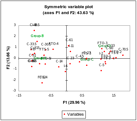
Figure 8 is a map in which the respondents are grouped along with the variable values that went into the map: information-technology-orientation (I), consecration (C), FreshTechSelf (FTs) and FreshTechOther (FTo). This allows the reader not only to see where each of the respondents falls within the space, but also where each of the variable values falls as a position within the space. For example, in the lower-right quadrant, a value of 1 for FTs (a low value) lies close to a value of 14 (a relatively high value) for consecration. In the upper-right quadrant, respondent R08 (group C) lies relatively close to the value of 2 for FTo, and very near a cluster of variable values that are difficult to read because of their proximity. That cluster contains such values as a 2 for FTs. In the lower-right quadrant respondent R13 (group C) lies somewhat close to a value of 14 for information-technology-orientation (a relatively high score), and close to a score of 5 for consecration, a relatively low score. Thus, R08 and R13, members of the same group, fall in similar places horizontally on the map, but are separated vertically. In contrast, respondent R04 (group D) lies in the lower-left quadrant, close to scores such as a 4 for FTo (a high score). R04 also lies near a cluster of values and respondents that is effectively impossible to read because they fall so close together.
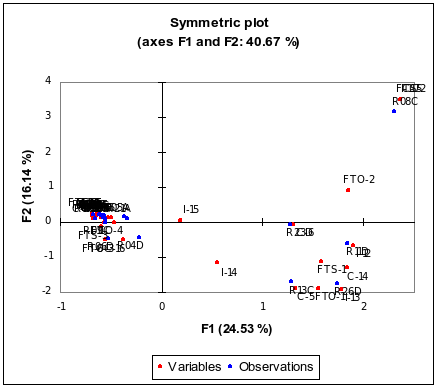
Figure 8 includes several features that were not present in the graphics used for the earlier examples. The percentage at the top of Figure 8, 40.67%, indicates the percentage of variance, or inertia, accounted for in the figure. In the context of the analysis, the term inertia is used to describe 'the extent to which the profile points are spread around the centroid' (Clausen, 1998: 14). Hence, a row or column profile in which the scores vary from the expected profile values will have increasing inertia as that variance increases. The percentages in the axis labels, 16.4% and 24.53%, indicate the percentage of inertia explained by each axis, with the total explained inertia being 40.93%. The rest of the inertia is lost.
The lost inertia represents the intellectual cost for the interpretative clarity provided by the map. For a simple, manufactured example like those described in Figures 5 and 6, the interpretative gain is minimal. However, as the number of variables and respondents grows, the interpretative gain we receive from the graphical display can outweigh the decrease in the amount of inertia described by the map. The map from Bourdieu (1984: 262) accounts for a total of only 9.4% of the inertia. However, the map incorporates a large number of dimensions. In addition to describing the positions of particular artists and cultural phenomena, the map also describes the occupation of a respondent's father, among many other variables. The resulting map allows us to see what relationship that part of a respondent's background might bear with particular patterns of consumption of art. But because the number of variables being mapped onto the two axes is so large, we sacrifice detail in order to gain a useful, albeit very general, level of interpretation. Tabular data with a large number of dimensions are difficult to interpret for trends, and a space meant to depict all of the dimensions fully would be virtually unreadable.
The computation of the axes is mathematically complex, but conceptually relatively simple. Table 2 shows data points in five-dimensional space, with each variable constituting a dimension. Visualizing that space as a conventional scatter plot is not practical, especially in terms of easy interpretation of the resulting visualization. In the case of multiple correspondence analysis, a smaller number of axes, typically two, are computed from the higher-dimensional space. The first axis is the least-squares line that captures as much of the variance as possible. In other words, 'maximization of variance along the axis is equivalent to minimizing the variance of the projection distances from the axis' (Gauch, 1982: 137). The second axis is orthogonal to the first, and captures as much of the remaining variance as possible. Each axis will account for less of the total inertia than the axis before it. This can continue for more dimensions, but for ease of interpretation the analysis is usually restricted to two dimensions.
| # | Group | FTs | FTo | C | I |
|---|---|---|---|---|---|
| R01B | B | 5 | 5 | 12.5 | 17 |
| R02A | A | 5 | 5 | 4.5 | 19 |
| R03C | C | 5 | 5 | 8 | 10 |
| R04D | D | 5 | 4 | 16 | 14 |
| R05A | A | 5 | 5 | 8 | 15 |
| R06D | D | 3 | 3 | 16 | 6 |
| R07B | B | 5 | 4 | 13 | 16 |
| R08C | C | 2 | 2 | 7 | 11.5 |
| R09C | C | 3 | 4 | 8 | 11 |
| R11D | D | 1 | 2 | 14 | 12 |
| R12A | A | 5 | 5 | 9.5 | 22 |
| R13C | C | 1 | 1 | 5 | 14 |
| R14A | A | 5 | 5 | 8 | 21 |
| R15A | A | 5 | 5 | 9 | 21 |
| R16A | A | 5 | 4 | 9.25 | 17 |
| R17C | C | 3 | 5 | 7.5 | 9 |
| R20B | B | 5 | 4 | 10.5 | 17 |
| R21A | A | 5 | 4 | 8 | 15 |
| R23D | D | 1 | 2 | 6 | 15 |
| R25A | A | 4 | 5 | 13 | 9 |
| R26D | D | 1 | 1 | 14 | 13 |
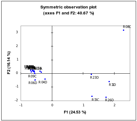
Figure 9 provides a somewhat clearer picture by eliminating all of the points except the respondents themselves. The biggest cluster of points, in the upper-left quadrant, remains largely unreadable. However, other parts of the map are more readable in this simpler form. A cluster of respondents lies in the lower-right quadrant, and all of these respondents are from groups C or D, the groups with low information-technology-orientation. In fact all of the easily visible respondents are from one of those two groups. This reflects the greater homogeneity of groups A and B, in which there was relatively little variance, and little polarization, as well. For example, all of the members of both A and B had a score of 5 for the variable FTs. The map thus reflects this homogeneity with respect to their valuation of technological innovation in their own writing by depicting them in similar aesthetic positions. The scores of respondents from groups A and B showed more variance on the other scales, but not enough to create a useful visual separation on the map.
The difficulty in interpreting Figure 9 is not simply a visual difficulty: the visual pile-up illustrates a potential interpretative problem with the scales used to build the map. The scales served a useful purpose for building a purposive sample. However, the scales can be refined to capitalize on the unexpected success they provided in the current study. The consecration scale serves as a good example. The original scale incorporated an item that attempted to measure the value of awards an author might have received. An author received 0.25 points for a minor award, e.g., having a poem declared the best in a particular issue of a magazine. An author was awarded 1 point for a major award such as a Pulitzer. This made a Pulitzer worth 4 times the value of a minor award. This proved sufficient as part of sorting the sample. However, a certain amount of critical judgement can play a useful role in this context. It is entire likely that many members of the literary community would see a bigger gap between the value of a minor award and the value of a major award such as a Pulitzer. That itself would make an interesting question for future research to establish the context in which artistic use of information technology occurs.
In an experiment with modifying the scale, major awards such as a Pulitzer were given a value of 10, making such awards 40 times more valuable than minor awards. It is important to note that only the assigned values were altered, not the respondents' responses or the criteria for deciding what constituted a major or minor award. The same held true for the other values that went into consecration and information-technology-orientation. Table 3 shows the resulting differences. The gray-shaded cells contain numbers from the revised scales. Respondent R26 serves as an excellent example. R26 is a Pulitzer Prize winning author and has also won other major awards. On the original scale, his consecration score was 14. On the revised scale, his score jumped to 90. The scores for the other respondents also changed. The scale for information-technology-orientation (I in Table 3) was also adjusted.
| # | Group | FTs | FTo | C | C | I | I |
|---|---|---|---|---|---|---|---|
| R01B | B | 5 | 5 | 12.5 | 33.5 | 17 | 15 |
| R02A | A | 5 | 5 | 4.5 | 4.5 | 19 | 11 |
| R03C | C | 5 | 5 | 8 | 23 | 10 | 2 |
| R04D | D | 5 | 4 | 16 | 61 | 14 | 11 |
| R05A | A | 5 | 5 | 8 | 30.5 | 15 | 11 |
| R06D | D | 3 | 3 | 16 | 33 | 6 | 11 |
| R07B | B | 5 | 4 | 13 | 43.5 | 16 | 10 |
| R08C | C | 2 | 2 | 7 | 4.5 | 11.5 | 2 |
| R09C | C | 3 | 4 | 8 | 27 | 11 | 2 |
| R11D | D | 1 | 2 | 14 | 70.5 | 12 | 2 |
| R12A | A | 5 | 5 | 9.5 | 15.5 | 22 | 20 |
| R13C | C | 1 | 1 | 5 | 5 | 14 | 6 |
| R14A | A | 5 | 5 | 8 | 30 | 21 | 20 |
| R15A | A | 5 | 5 | 9 | 31 | 21 | 15 |
| R16A | A | 5 | 4 | 9.25 | 31.5 | 17 | 15 |
| R17C | C | 3 | 5 | 7.5 | 14 | 9 | 6 |
| R20B | B | 5 | 4 | 10.5 | 30.5 | 17 | 11 |
| R21A | A | 5 | 4 | 8 | 14 | 15 | 6 |
| R23D | D | 1 | 2 | 6 | 33 | 15 | 2 |
| R25A | A | 4 | 5 | 13 | 12 | 9 | 6 |
| R26D | D | 1 | 1 | 14 | 90 | 13 | 11 |
| Max: | 16 | 90 | 22 | 20 | |||
| Min: | 4.5 | 4.5 | 6 | 2 |
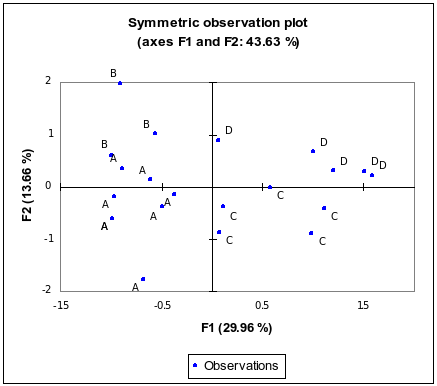
Figure 10 shows what happens with the revised scales. Several changes take place. First, the data points in the left portion of the map appear farther apart, aiding interpretation by reducing the clustering that hampered readability in Figures 8 and 9. Perhaps more importantly, however, some of the respondents' positions have been altered. For example, R26, the Pulitzer Prize winner, lies near R06, R11, and R23. R08 no longer appears as an outlier, but lies along one edge of the total cluster of respondents. The closest any respondent comes to being an outlier in Figure 10 is R07, but R07 lies closer to adjacent respondents than R08 did in the previous map.
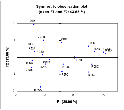
The cluster of R06, R11, R23, and R26 in Figure 10 serves as a good illustration of the effect of the altered scales. All four of those respondents scored above the median for consecration, in several cases, R11 and R26, well above. All four fall at or below the median for information-technology-orientation, and below the median for FTs and FTo. A qualitative examination of the respondents in the cluster also shows the value of the new clustering. R26, as already mentioned, is a Pulitzer Prize-winning poet. R23 is a novelist and National Book Award Winner. R11 is a well-anthologized expatriate poet, whose work has been published widely, and who has received or been a finalist for several prominent literary prizes. R06 is another widely published poet with multiple books and literary awards to her credit. These four writers, then, form a coherent cluster with similar positions in the literary field. In addition to the quantitative similarities in their responses, they also make a suitable qualitative cluster.
The same authors were not clustered as effectively in Figure 9. In that figure, the point for R13 lies much closer to R11, R23, and R26 than it does in Figure 10. In contrast, R06 lies noticeably further away to the left. The cluster is also not as tight even for R11, R23, and R26. R13, however, is not as good a fit for the cluster. While R13 falls below the median for information-technology-orientation, FTs, and FTo, he enjoys a significantly lower degree of consecration. R13's consecration score is 5, while the next lowest among R06, R11, R23, and R26 is 33.
Thus, by adjusting the quantitative values assigned to the respondents' responses, we can improve the interpretative power of the clustering. Expanding the scale does more than adjust the spacing of points on the map. It allows for finer distinctions between various positions within the space, which aids intellectual interpretation, not just visual interpretation. This suggests that the increased variance created by the revised scales has more than intuitive appeal, and points to possibilities for tuning the scales used in the current study. Both the qualitative and quantitative data suggest that the map produced by the altered scales reflects the actual aesthetic positions taken by the respondents within the techno-literary space. Additional tuning of the scales through further research may produce maps with an even higher level of descriptive usefulness.
With the adjusted scales we can begin to see other patterns in the resulting space. Figure 11 shows variable values and the individual groups as points in the space rather than individual respondents. Some crowding results, but the space is still readable. Groups A and B lie relatively close together in the left half of the space, and groups C and D fall relatively close together in the right half. We can also take another look at the area that contained our example cluster of R06, R11, R23, and R26 in Figure 10. Now instead of the four respondents, we can see Group D, which includes those four respondents. The point for Group D lies close to high scores for consecration, and close to middle to low scores for information-technology-orientation. Group D can thus be said to lie close to the position of high consecration. This is the kind of result to which Bourdieu (1996) referred in describing artistic position-taking, but with an additional focus on information technology use by authors, which was not included in Bourdieu's work.
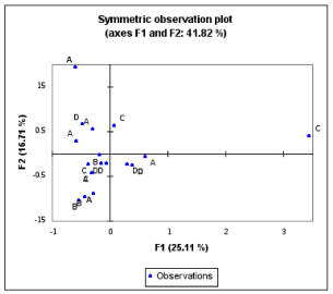
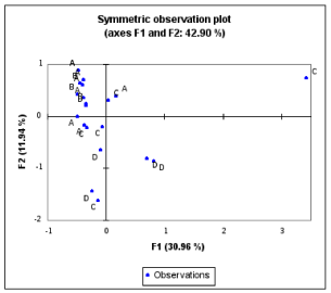
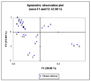
Figure 12 shows an additional permutation with the data point for each respondent labelled with the group letter to which that respondent belonged. Notice in Figure 12 that the four groups (A-D) are clearly separated. Groups A and B nearly overlap, but overall the groups are separated. This reinforces the utility of the original quadrants. When we take into account the differences based on the respondents' views of technological innovation in writing, and their varying degrees of consecration and information-technology-orientation, they sort neatly into groups. Groups A and B, the most similar of the two groups, especially with regard to their valuation of technological innovation in writing, overlap substantially.
A final set of maps will help further illustrate their value, as well as demonstrate other findings from the current study. In addition to being asked to rate how positively they viewed technological innovation in their own writing and the writing of others, the respondents were also asked to rate how positively or negatively they viewed innovative writing in their own writing and the writing of others regardless of the technology used to create it. These two variables are abbreviated Fs and Fo.
Figure 13a shows a map that includes Fs, Fo, consecration, and information-technology-orientation, but not the variables relating to high regard for technological innovation in one's own or others' work (FTs or FTo). Except for one relative outlier from Group C, the respondents cluster close together, with strong intermixing of members from different groups. Figure 13b shows the same map, but with the scale on the x axis adjusted to eliminate the outlier from Group C. This has the effect of zooming in to better see how members of the four groups are intermixed on this map. Thus, when the focus is on innovation in writing more generally, regardless of the technology used to produce the writing, the respondents are intermixed on the map. There are no clear distinctions to be made between the groups in that context. The more- and less-consecrated, and more- and less-information-technology-oriented authors, show the same basic distribution across the map. This reflects a relative homogeneity in their aesthetic positions with regard to general innovation in writing. Bourdieu (1996) and others have argued that valuation of innovative writing is a core value of the literary community, and the evidence in the current study reinforces that idea. Respondents across all four groups expressed high valuation of innovation in writing.
|
|
| Figure 13a: Multiple correspondence analysis map with non-technological innovation. | Figure 13b: Multiple correspondence analysis map with non-technological innovation, without outlier. |
Figures 14a and 14b are similar to 13a and 13b, except that they incorporate data for the variables relating to high regard for technological innovation in one's own or others' work (FTs, FTo), Fs, Fo, consecration, and information-technology-orientation. One author, from Group C, remains an outlier in Figure 14a. Figure 14b is the same map as 14a, but again with the scale on the x axis adjusted to eliminate the outlier. There is some intermingling of the groups, e.g., in the upper left quadrant where a member of Group D is clustered with members of Groups A and B. The overall pattern, however, shows separation between the more- and less-information-technology-oriented groups. The respondents in Groups A and B, the more information-technology-oriented groups, cluster in the upper left quadrant. The respondents in Groups C and D scatter more widely than do the respondents in Groups A and B, but the C and D respondents lie intermixed with each other more than with the respondents from Groups A and B.
|
|
| Figure 14a: Multiple correspondence analysis map with technological and non-technological innovation. | Figure 14b: Multiple correspondence analysis map with technological and non-technological innovation, without outlier. |
These maps help to illustrate one of the key findings in the current study: support for intensifying use of technology, a conceptual construct posited in the first study in this series (Paling and Nilan 2006). As mentioned earlier, this concept has three elements: recognition of new forms of support for a key value; incomplete rejection of traditional forms of support for the key value; and placement of greater emphasis on the newer forms of support.
In Figure 12, which is based on data that includes the variables FTs and FTo, the technology-related variables, shows greater dispersion of the respondents. Their opinions diverge with regard to technological innovation in writing. In contrast, Figures 13a and 13b, which include the variables Fs and Fo, the variables that address the valuation of innovative writing regardless of the technology used to produce it, show all but one outlier respondent clustered relatively close together, with the groups intermixed.
Figures 14a and 14b include FTs, FTo, Fs, Fo, as well as consecration and information-technology-orientation (the last two variables are incorporated in the earlier maps, as well). The members of each group cluster close together in most cases, and there is less intermixing between the groups. Members of Groups A and B, the more information-technology-oriented groups, recognize newer forms of support for avant-garde-ism. This helps create the spread seen in Figure 12. But their incomplete rejection of traditional forms of support helps create the closer clustering seen in Figure 13b. It emerged clearly in the qualitative data (Paling 2008) that the authors in Groups A and B supported the general valuation of avant-garde literature, but preferred the newer forms of support. The maps provide graphic illustration of those differences and similarities between the groups.
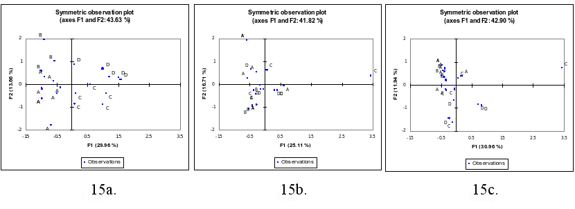
Figure 15 shows one final comparison. The three maps in Figure 15 reproduce, respectively, Figures 12, 13a, and 14a. The x and y axes, though, have been altered so that they are the same in all three maps. This allows more effective side-by-side comparison since the axes were not uniform in the earlier figures. Figure 15a, which includes the variables FTs and FTo,but not Fs or Fo, shows the greatest dispersion overall, and relatively strong separation between the groups. This reflects the variation in the valuation of technological innovation in writing. Figure 15b, which includes the variables Fs and Fo, but not FTs and FTo, shows a lower level of dispersion, and strong intermixing between the groups. This reflects the consensus valuation within the literary community of innovation in writing without regard to the technology used to produce the writing. Finally, Figure 15c, which includes the variables FTs, FTo, Fs, and Fo, shows relatively low dispersion, but retains the overall separation between the groups. This reflects the consensus about general innovation in writing, but the mixed opinions about technological innovation in writing. Along with those similarities and differences of opinion, measures of consecration and information-technology-orientation also help establish groups of authors who have taken similar positions within the literary field. Juxtaposing the identically scaled maps side by side makes the comparisons easier.
Multiple correspondence analysis offers strong interpretative utility for studies in which we want to reduce multidimensional data to a smaller number of dimensions for graphical display. It had particular interpretative utility for the current study in which the authors' aesthetic positions were part of the primary focus. It allowed the construction of spaces that not only took into account Bourdieu's concept of consecration, but also allowed the incorporation of additional evidence related to information-technology-orientation. This additional measurement could be done without the maps, but these allow us to see not only where the respondent's lie with respect to each other, but also where they lie with respect to categorical positions such as extreme valuation of technological innovation in writing. The technique thus serves as a complement to tabular or qualitative data which can be difficult to interpret for trends, once the number of questions or data dimensions grows past a small number.
The current study accomplished several methodological goals. It allowed us to go beyond feature interviews with individual authors and into structured empirical inquiry. Bourdieu (1984, 1996) had already done that. However, his work differed from the current study in several ways: it did not take into account the role of information technology in the working lives of literary authors and his work covered a wide swath of the arts in less depth than the current series of studies. By focusing exclusively on literary authors the current study allowed us to begin assembling a detailed picture of how their use of information technology affects their work.
Multiple correspondence analysis also aided the substantive goals of the study, which found supporting evidence for Positive Regard for Avant-garde-ism, and for Intensifying Use of Technology. The quantitative results with respect to Positive Regard for Avant-garde-ism were interesting in themselves, but the maps added a useful interpretative dimension to the discussion; they made it possible to visualize what the techno-literary space occupied by the respondents looked like. We could see which authors ended up grouped together and how closely different groups clustered. It became apparent, for example, that the more information-technology-oriented authors who valued technological innovation in writing had a smaller range of opinions than did the less information-technology-oriented authors. That kind of trend is more difficult to spot in tabular data. The maps made the trends much more apparent and interpretable.
The current study is part of a series of developmental studies; consequently, the scales and categories being used are also developmental. The use of maps aided the adjustment of those scales. This was particularly important with respect to the consecration scale. The basic items on the scale, minor awards, major awards, etc., were relatively easy to define. However, the quantitative values applied to the items were more difficult to specify. The maps allowed us to see what effect various versions of the scaling had on the respondents' positions in techno-literary space. For example, increasing the numeric spread on the consecration scale had two benefits. First, the increased spread opened up tight clusters of positions, making the map more readable. More importantly, the maps that incorporated the data with the increased spread also matched the qualitative data more closely, making for a better conceptual fit. Thus, in addition to aiding interpretation of the current study, the maps also pointed toward productive questions for future studies. Those studies could provide evidence to aid refinement of scales for phenomena such as consecration. For example, the studies might explore how much emphasis members of the literary field give to particular types of awards. That opens the possibility of valid scales for measuring perceptions of consecration on the part of literary authors. The current scales for consecration and information-technology-orientation, however, have proved adequate for data exploration.
The idea of mapping techno-literary spaces has clear usefulness. Previous efforts by Bourdieu (1984, 1996) have been successful in establishing the utility of multiple correspondence analysis maps for describing the aesthetic positions of members of artistic communities such as American literary writing. Understanding those positions helps us to understand the values that typify social structures such as genres, and how actors within artistic communities can support, subvert, or alter those values. The previous work has not clearly established how information technology use by members of artistic communities can be used in those processes of valuation. The current series of studies has begun to establish the role of the technology in supporting and altering the values that have typified American literary publishing. Literary authors can use the technology to establish new and innovative forms of literature and those new forms of literature, if accepted by the literary community, can expand the range of artistic possibilities. As the practitioners of those new technological possibilities age into more consecrated positions, the new forms of literature become part of the palette of the consecrated avant-garde. The maps played a productive role in demonstrating that by aiding interpretation of the data and by aiding exploration of possible alternatives in scale development. These are important steps in establishing Literature and Art Informatics as a thoroughgoing approach to studying the effect of information technology use on the activities of authors and other artists.
An earlier version of this paper was presented at the Social Informatics Symposium at the Annual Meeting of the American Society for Information Science and Technology in Milwaukee, WI, on October 19th, 2007.
| Find other papers on this subject | ||
© the author, 2009. Last updated: 20 May, 2009 |
|
